Client
ValGenesis Pvt Ltd
My Role
UX Designer & Design Lead
Year
2025
Project Scope
Web & Mobile App


Back
A full UX redesign of ValGenesis Smart GxP's form builder — transforming a legacy, constrained tool into a modern, scalable configuration platform for
pharmaceutical compliance workflows
Client
ValGenesis Pvt Ltd
My Role
UX Designer & Design Lead
Year
2025
Project Scope
Web & Mobile App
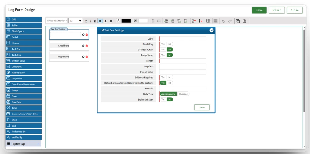
The existing form builder had several critical issues rooted in technical debt and outdated UX patterns — creating friction for administrator working in high-stakes pharmaceutical environments.
Limitations
Built on older frameworks with limited component flexibility, making it nearly impossible to introduce modern UX patterns.
Poor Discoverability
Configuration options were scattered across the interface. Users consistently struggled to locate field settings.
Inefficient Form Creation
Built on older frameworks with limited component flexibility, making it nearly impossible to introduce modern UX patterns.
Scalability Issues
Adding or modifying form elements required multiple steps with limited customization options for users.
Research drove every design decision — from stakeholder alignment to validating interaction patterns with real users
For this massive project, I served as a co-lead and core member of the design system steering committee, guiding the system from conception through organization-wide adoption. I’ve co-led strategy, structure, and integration of decisions across design and engineering, ensuring alignment with regulated pharma workflows.
Understand business requirements, technical constraints, and compliance needs to inform design decisions
Design Impact: Introduced modular component architecture
Design Impact: Created a configurable properties panel
Design Impact: Designed for future field type scalability
Design Impact: Removed the Grid based control system
Design Impact: Introduced drag-and-drop editor
Consolidated settings into one properties panel
Added inline component actions

James Smith
System Admin
Pharmaceutical Manufacturing | 10 years in compliance system
⭐️
⭐️
⭐️

Pradeepa
Validation Engineer
Life Sciences | 5+ years in validation documentation
⭐️
⭐️
⭐️
No clear indication of selected field state
Clear selection states with visual highlight
Different field types had different settings locations
Consistent field configuration panel for all types
Repetitive configuration steps for every field
Inline actions to reduce navigation overheard
Users could easily misconfigure fields with no guard rails
Easy to visualize final form layout
Reduced form creation from a fragmented multi-screen workflow to a fluid four-step process within a single view.

Select from the field library: Dropdown, Text, Radio, Lookup

Set label, defaults, system values, entity mapping

Drag components to reorder mirrors - final document structure

Save draft, cancel, or move to next step in the workflow
The legacy builder used custom, inconsistent UI components. The redesign aligned fully with the newly introduced ValGenesis design system PULSE — enabling consistency, faster development, and future scalability.
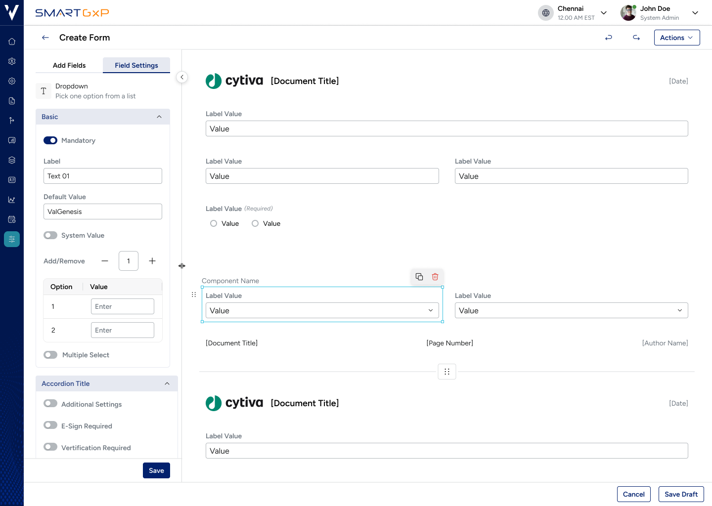
Reusable building blocks across the entire platform
Engineers build new features without recreating UI elements
Component-driven builder makes adding new field types easy
The redesigned form builder delivered tangible improvements across efficiency, adoption, scalability, and platform consistency
Back
A full UX redesign of ValGenesis Smart GxP's form builder — transforming a legacy, constrained tool into a modern, scalable configuration platform for
pharmaceutical compliance workflows
Client
ValGenesis Pvt Ltd
My Role
UX Designer & Design Lead
Year
2025
Project Scope
Web & Mobile App
The existing form builder had several critical issues rooted in technical debt and outdated UX patterns creating friction for administrator working in high-stakes pharmaceutical environments.
Limitations
Built on older frameworks with limited component flexibility, making it nearly impossible to introduce modern UX patterns.
Poor Discoverability
Configuration options were scattered across the interface. Users consistently struggled to locate field settings.
Inefficient Form Creation
Built on older frameworks with limited component flexibility, making it nearly impossible to introduce modern UX patterns.
Scalability Issues
Adding or modifying form elements required multiple steps with limited customization options for users.
Research drove every design decision — from stakeholder alignment to validating interaction patterns with real users
For this massive project, I served as a co-lead and core member of the design system steering committee, guiding the system from conception through organization-wide adoption. I’ve co-led strategy, structure, and integration of decisions across design and engineering, ensuring alignment with regulated pharma workflows.
Understand business requirements, technical constraints, and compliance needs to inform design decisions
Design Impact: Introduced modular component architecture
Design Impact: Created a configurable properties panel
Design Impact: Designed for future field type scalability
Design Impact: Removed the Grid based control system
Design Impact: Introduced drag-and-drop editor
Consolidated settings into one properties panel
Added inline component actions
James Smith
System Admin
Pharmaceutical Manufacturing | 10 years in compliance system
⭐️
⭐️
⭐️

Pradeepa
Validation Engineer
Life Sciences | 5+ years in validation documentation
⭐️
⭐️
⭐️
No clear indication of selected field state
Clear selection states with visual highlight
Different field types had different settings locations
Consistent field configuration panel for all types
Repetitive configuration steps for every field
Inline actions to reduce navigation overheard
Users could easily misconfigure fields with no guard rails
Easy to visualize final form layout
Reduced form creation from a fragmented multi-screen workflow to a fluid four-step process within a single view.

Select from the field library: Dropdown, Text, Radio, Lookup
Set label, defaults, system values, entity mapping
Drag components to reorder mirrors - final document structure
Save draft, cancel, or move to next step in the workflow
The legacy builder used custom, inconsistent UI components. The redesign aligned fully with the newly introduced ValGenesis design system PULSE — enabling consistency, faster development, and future scalability.
Reusable building blocks across the entire platform
Engineers build new features without recreating UI elements
Component-driven builder makes adding new field types easy
The redesigned form builder delivered tangible improvements across efficiency, adoption, scalability, and platform consistency
Back
A full UX redesign of ValGenesis Smart GxP's form builder — transforming a legacy, constrained tool into a modern, scalable configuration platform for
pharmaceutical compliance workflows
Client
ValGenesis Pvt Ltd
My Role
UX Designer & Design Lead
Year
2025
Project Scope
Web & Mobile App
The existing form builder had several critical issues rooted in technical debt and outdated UX patterns — creating friction for administrator working in high-stakes pharmaceutical environments.
Limitations
Built on older frameworks with limited component flexibility, making it nearly impossible to introduce modern UX patterns.
Poor Discoverability
Configuration options were scattered across the interface. Users consistently struggled to locate field settings.
Inefficient Form Creation
Built on older frameworks with limited component flexibility, making it nearly impossible to introduce modern UX patterns.
Scalability Issues
Adding or modifying form elements required multiple steps with limited customization options for users.
Research drove every design decision — from stakeholder alignment to validating interaction patterns with real users
For this massive project, I served as a co-lead and core member of the design system steering committee, guiding the system from conception through organization-wide adoption. I’ve co-led strategy, structure, and integration of decisions across design and engineering, ensuring alignment with regulated pharma workflows.
Understand business requirements, technical constraints, and compliance needs to inform design decisions
Design Impact: Introduced modular component architecture
Design Impact: Created a configurable properties panel
Design Impact: Designed for future field type scalability
Design Impact: Removed the Grid based control system
Design Impact: Introduced drag-and-drop editor
Consolidated settings into one properties panel
Added inline component actions
James Smith
System Admin
Pharmaceutical Manufacturing | 10 years in compliance system
⭐️
⭐️
⭐️

Pradeepa
Validation Engineer
Life Sciences | 5+ years in validation documentation
⭐️
⭐️
⭐️
No clear indication of selected field state
Clear selection states with visual highlight
Different field types had different settings locations
Consistent field configuration panel for all types
Repetitive configuration steps for every field
Inline actions to reduce navigation overheard
Users could easily misconfigure fields with no guard rails
Easy to visualize final form layout
Reduced form creation from a fragmented multi-screen workflow to a fluid four-step process within a single view.

Select from the field library: Dropdown, Text, Radio, Lookup
Set label, defaults, system values, entity mapping
Drag components to reorder mirrors - final document structure

Save draft, cancel, or move to next step in the workflow
The legacy builder used custom, inconsistent UI components. The redesign aligned fully with the newly introduced ValGenesis design system PULSE — enabling consistency, faster development, and future scalability.
Reusable building blocks across the entire platform
Engineers build new features without recreating UI elements
Component-driven builder makes adding new field types easy
The redesigned form builder delivered tangible improvements across efficiency, adoption, scalability, and platform consistency