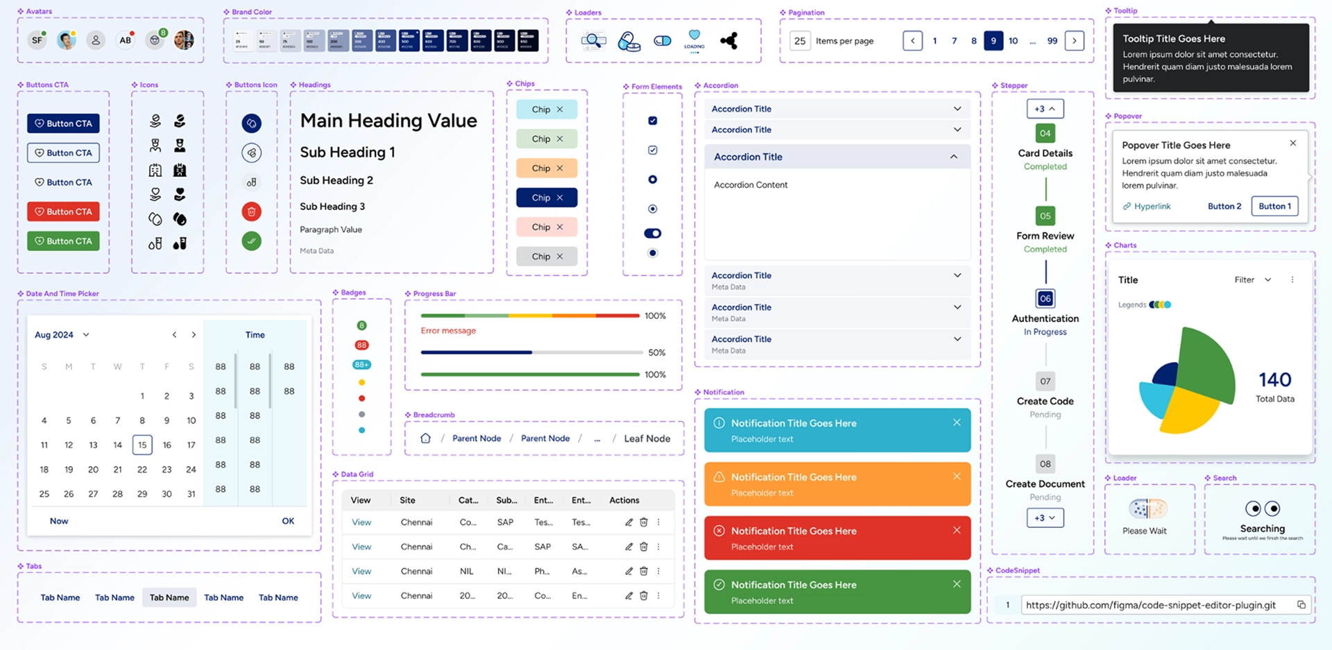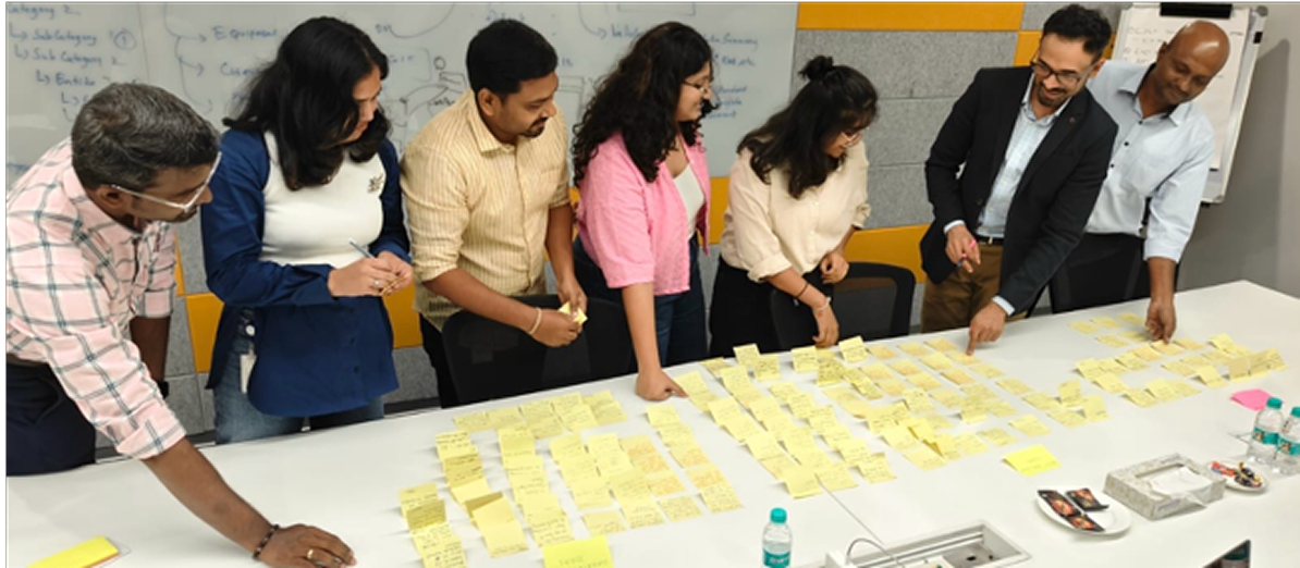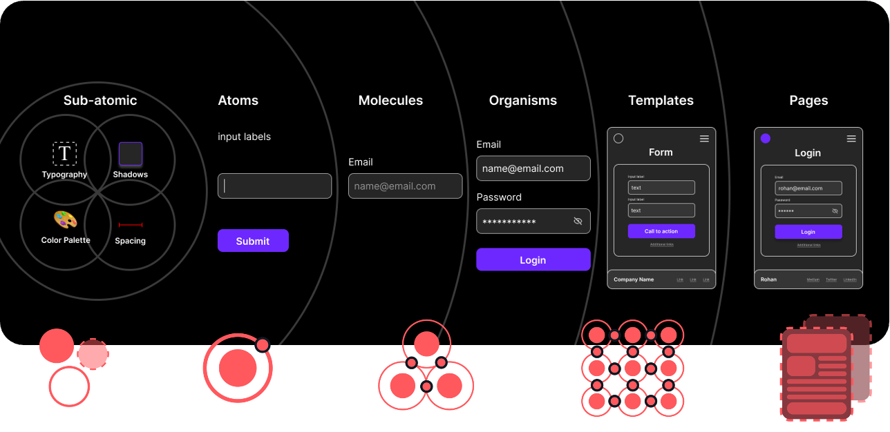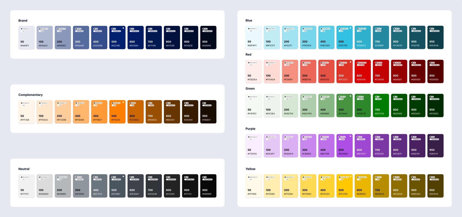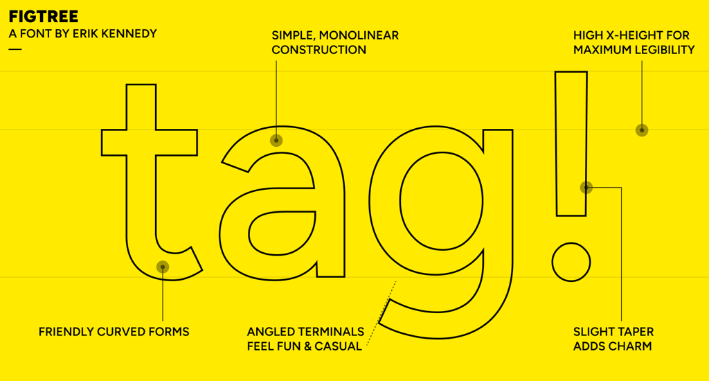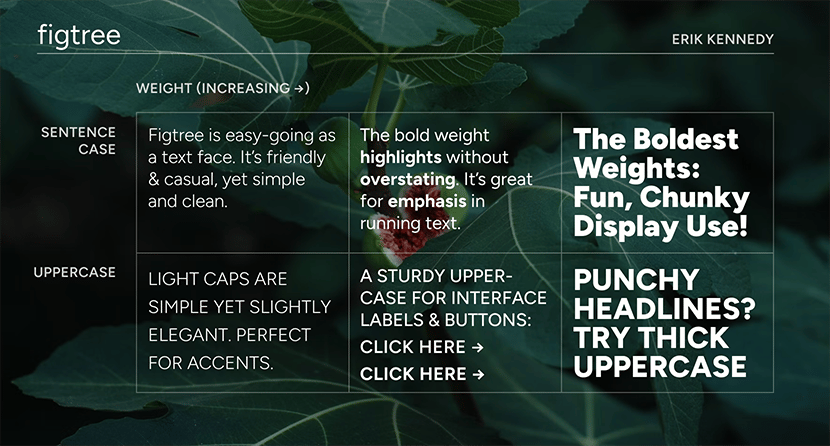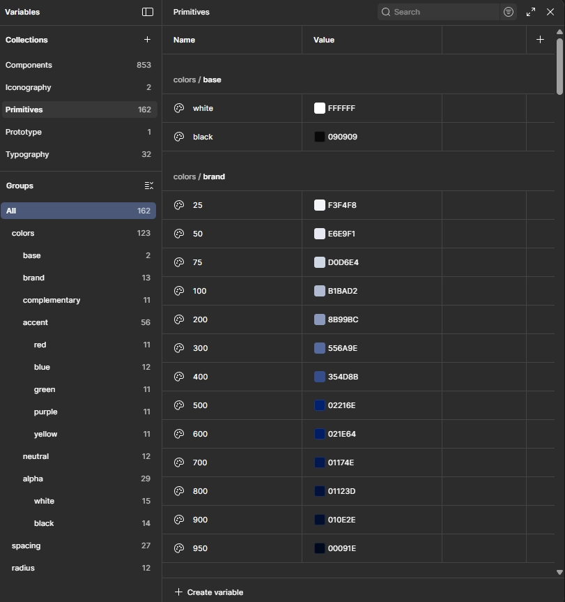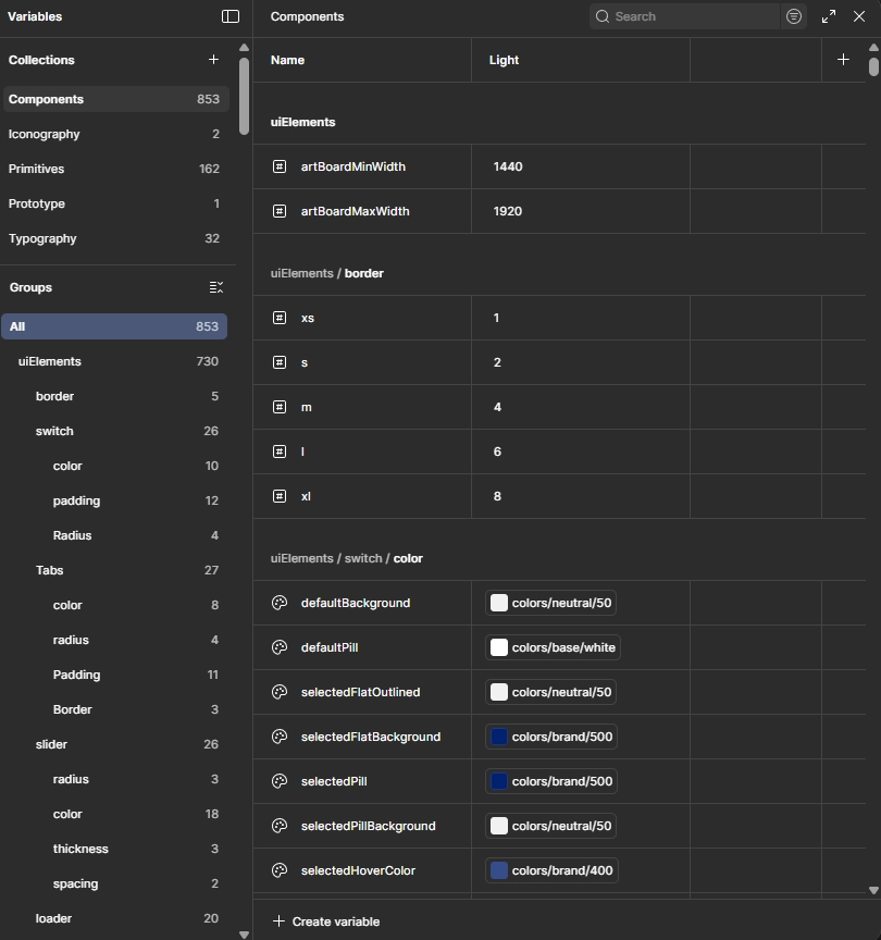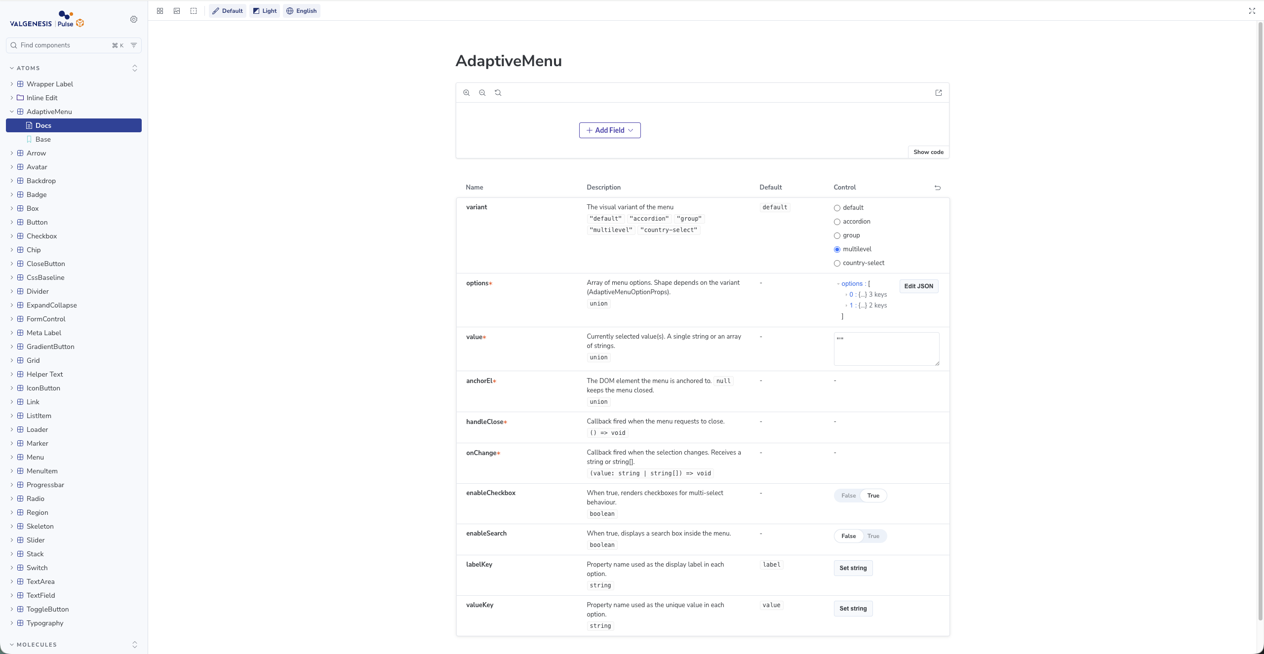
Establishing a unified design language and governance model across 5 enterprise products, resulted with an increase in product delivery by 3x, driving a 60% reduction in development cycle time and ensuring strict accessibility compliance across all applications.
Client
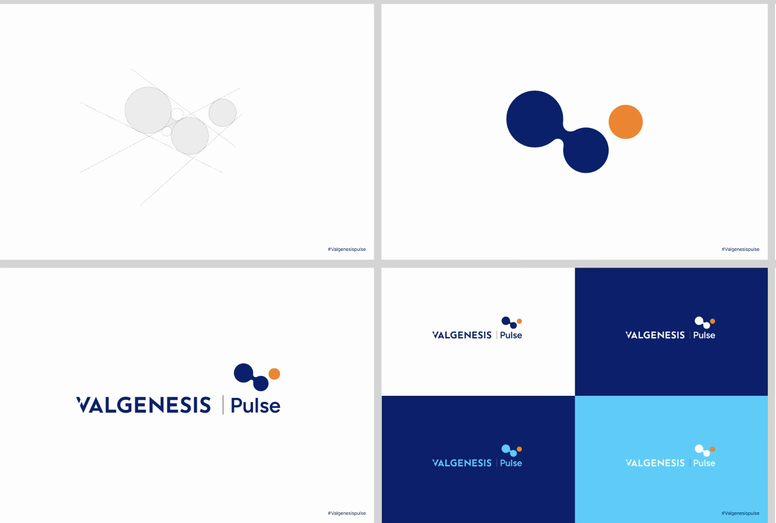
ValGenesis Pvt Ltd
My Role
Co-Lead
Year
2025
Project Scope
Web & Mobile App